Restless Idealist
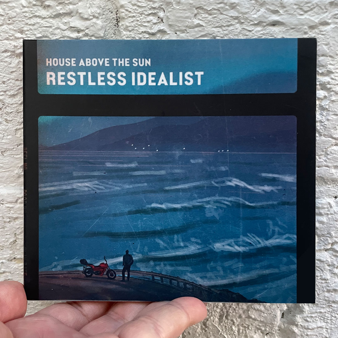
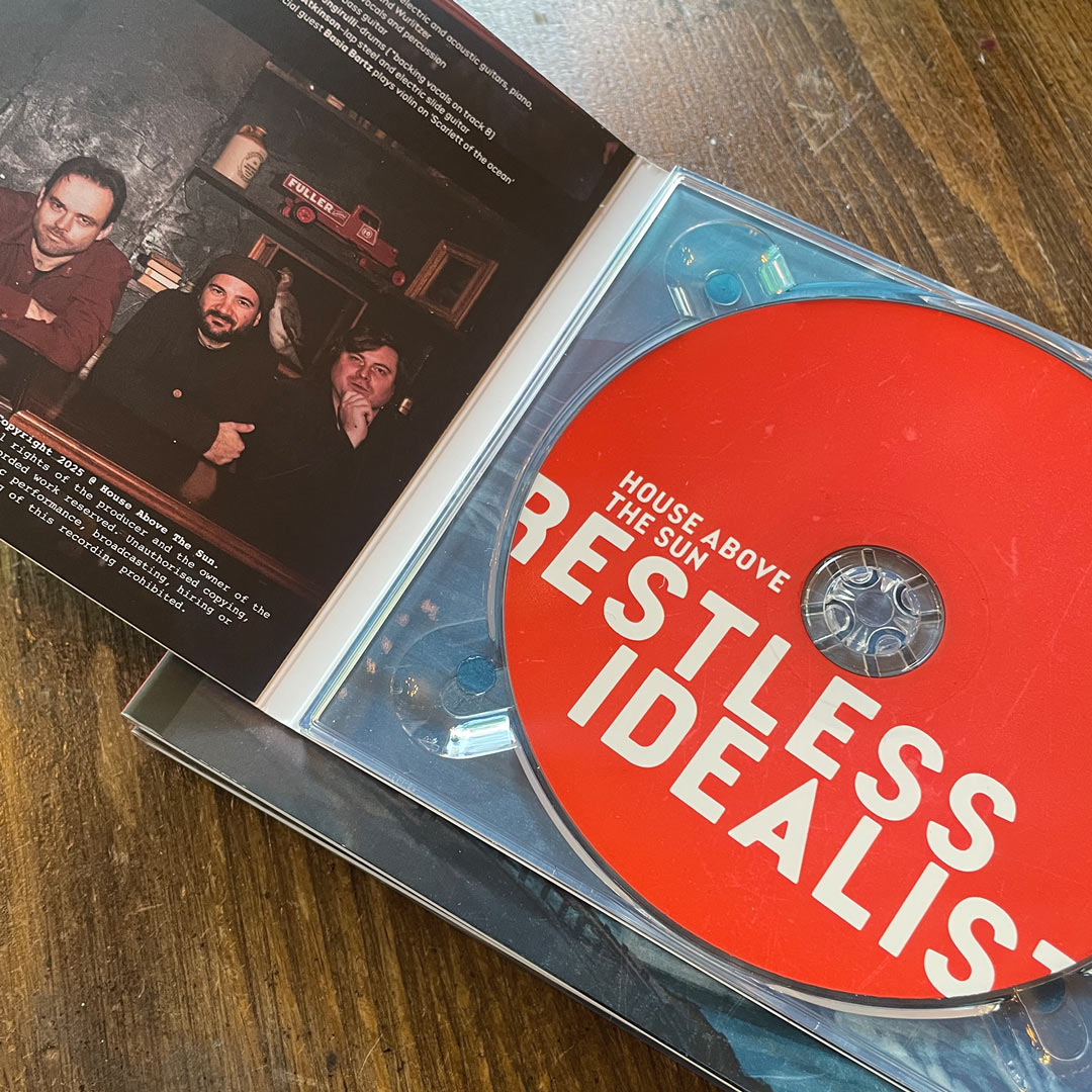
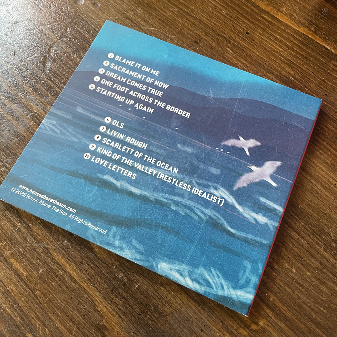
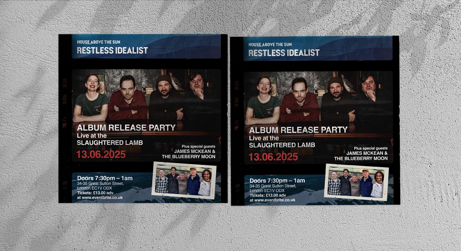
Album cover, CD design, promotional video and socials for the new album 'Restless Idealist' by House above the Sun
link to ︎︎︎ Spotify
link to ︎︎︎ Bandcamp
link to ︎︎︎ Spotify
link to ︎︎︎ Bandcamp
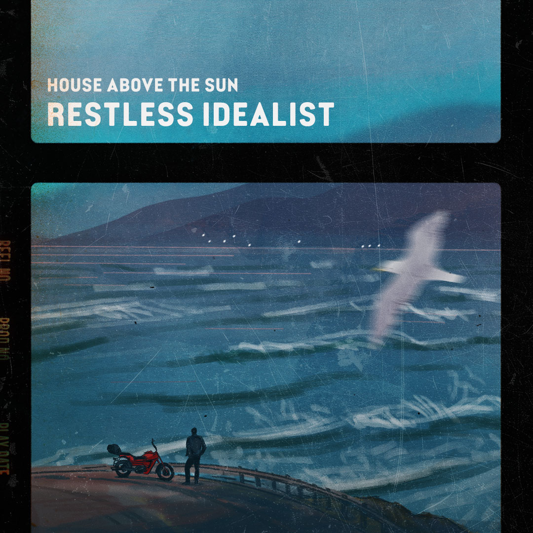
The theme and the colours of the album cover were inspired by the lyrics of the songs.


Undergound/
U-Bahn
Creative direction, observational drawing, graphical documentation, infographics, data visualisation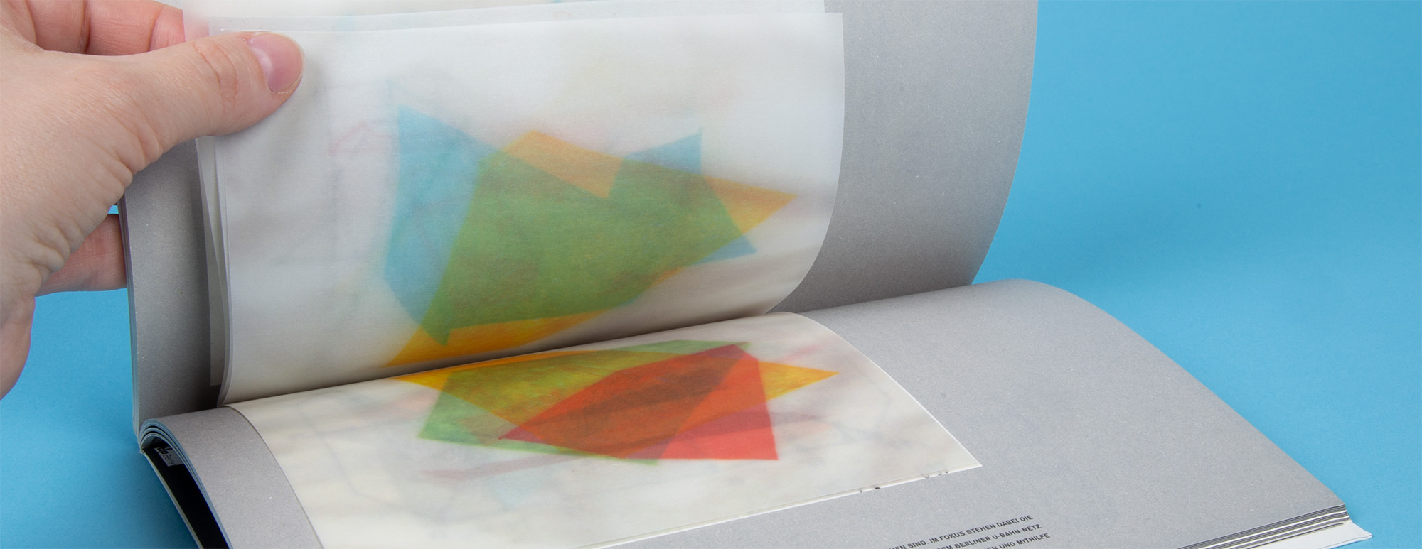
Underground / U-Bahn is a communication project focused on the finding a system in every day, data collection and visualisation. The process involved spending quite a lot of time in Berlin Underground stations. I went through the all stations of the area A, which is the central part, and fixated typography, colours, and sometimes drew the people there.
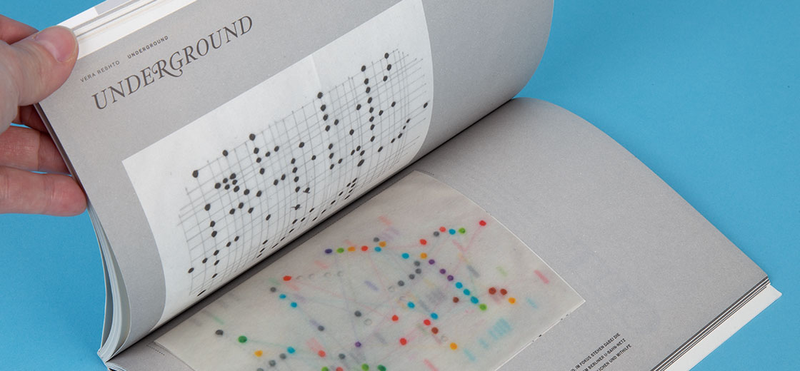
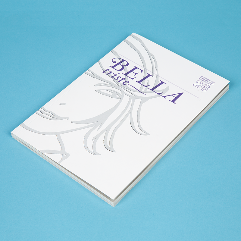
The task behind this project at the Weissensee Art School was to find a system in everyday activities and fixate it through drawings. After collecting all necessary data, I put Berlin A-area in the grid system, and by combining the station which have same dominant colour, came up with different graphs. This projects was published in magazine Bella Triste / issue 26, 2010
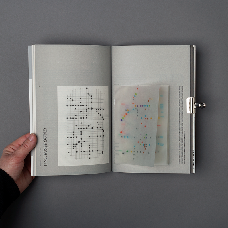
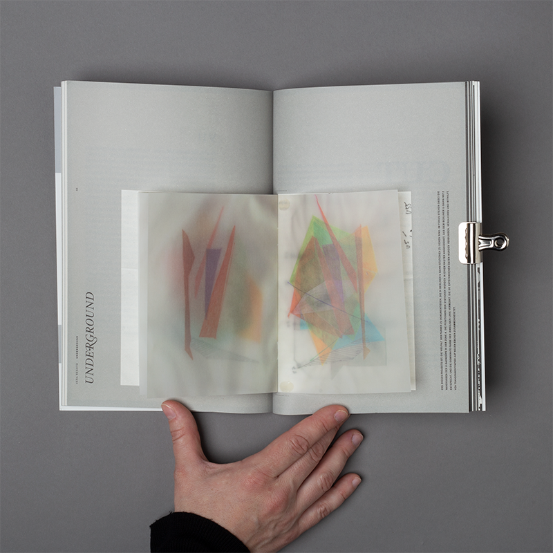
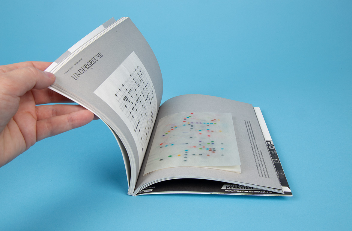
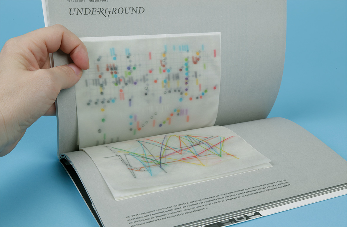
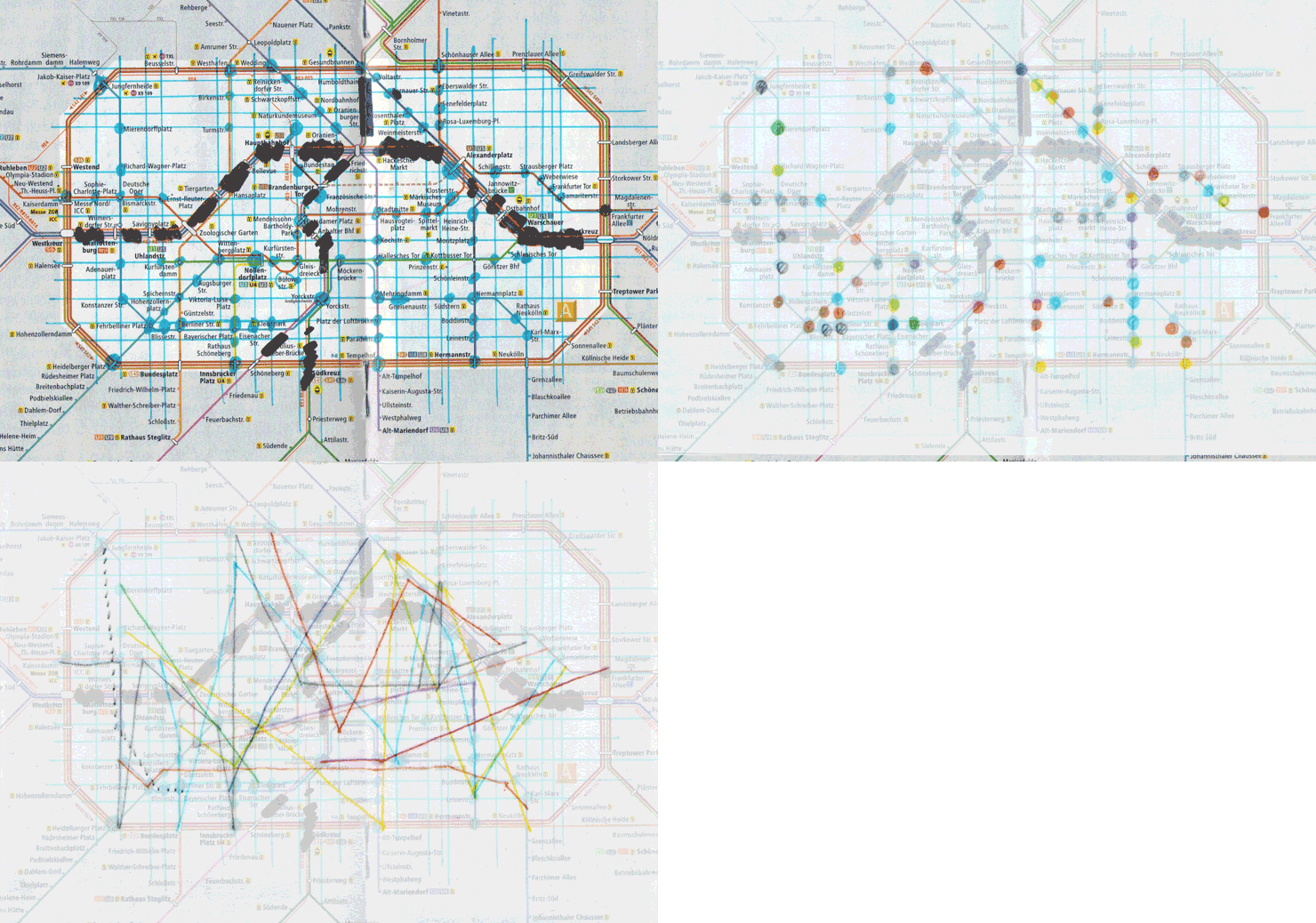
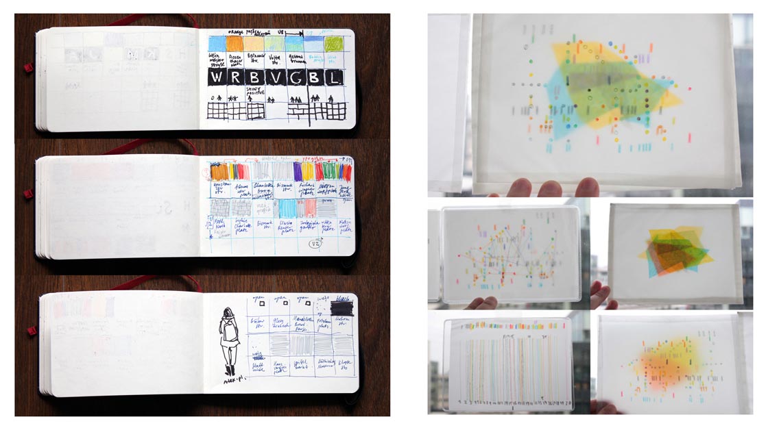
Fixation of the stations colour, finding a system
This is not a Newspaper
Digital illustration for the Art Section


Project:
Illustration for the Art section of This is Not a Newspaper as part of Transform your City 2014 with AAD, Offset 2014
The Art article could be found here in a digital version of this project. Text by Róise Goan.
Technique:
Digital illustration
Illustration for the Art section of This is Not a Newspaper as part of Transform your City 2014 with AAD, Offset 2014
The Art article could be found here in a digital version of this project. Text by Róise Goan.
Technique:
Digital illustration
“This is not news.
These stories are about South William street, Dublin, but not as it is, as it might be. Because, well, why not? Because we don't do it enough. Because imagining the possibilities should come before accepting the realities. Because looking too closely at something everyday can stop us from seeing how it really is, so sometimes it's good to look at things from a very different angle.”
Quote from publication
 Newspaper design by AAD
Animation Brochure
Creative direction, icon design, layout, digital illustration, custom typography
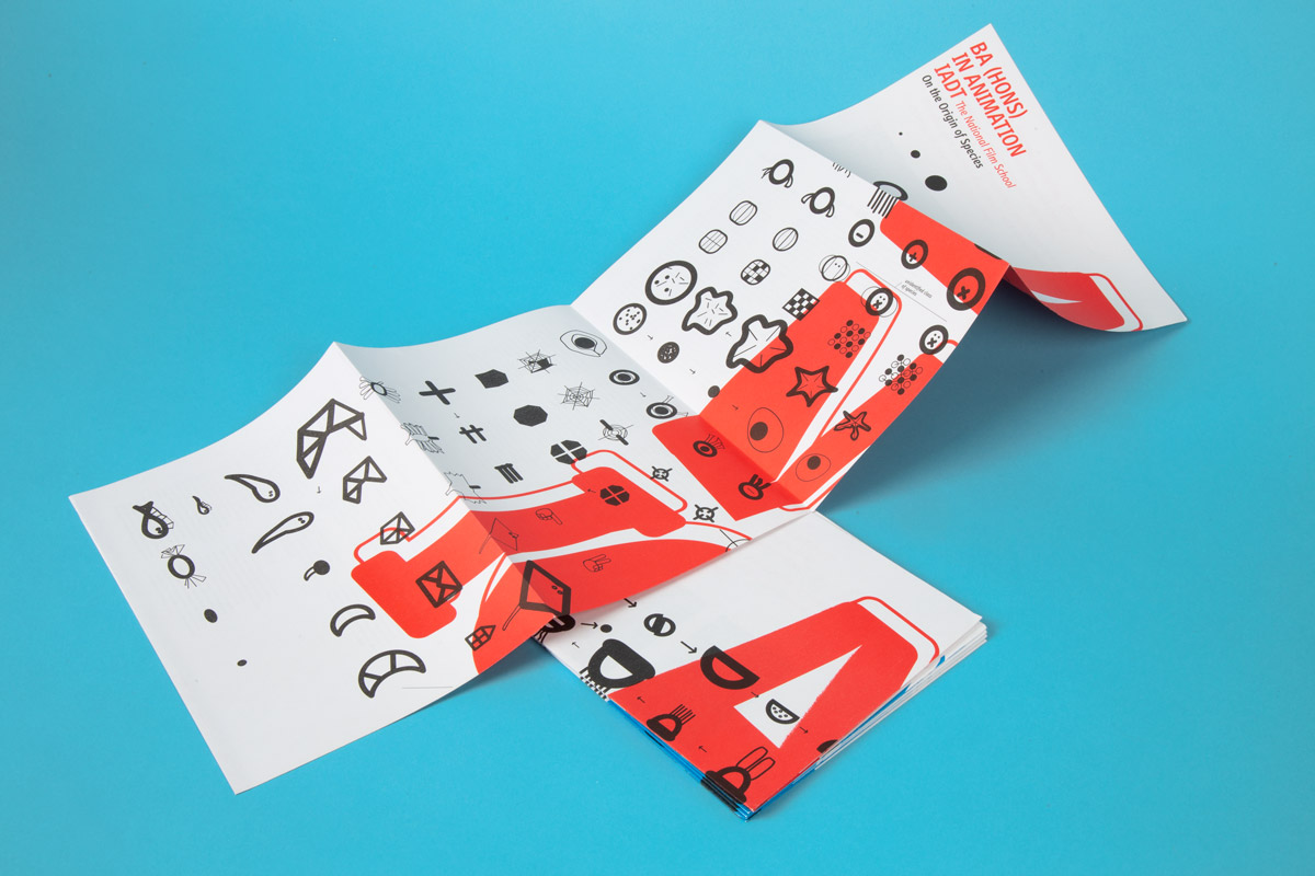
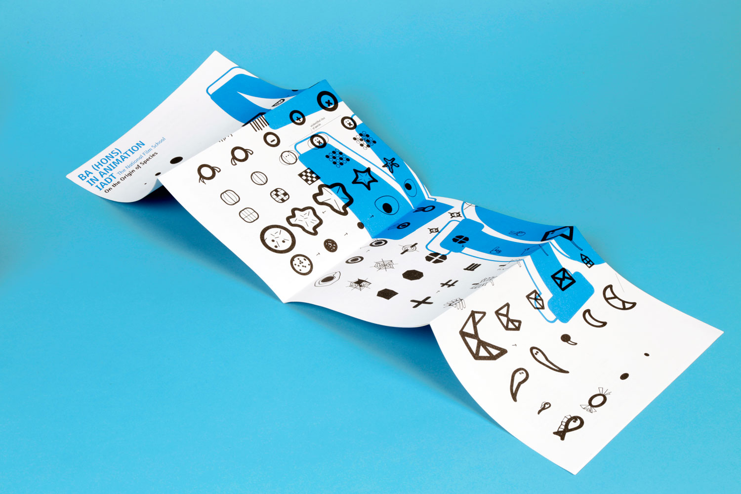
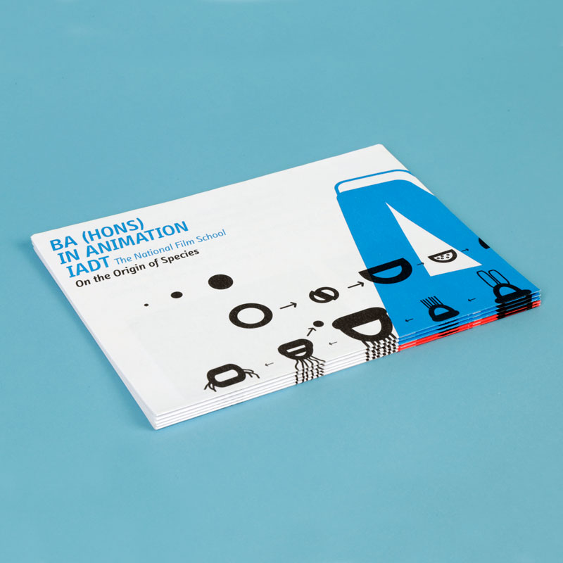
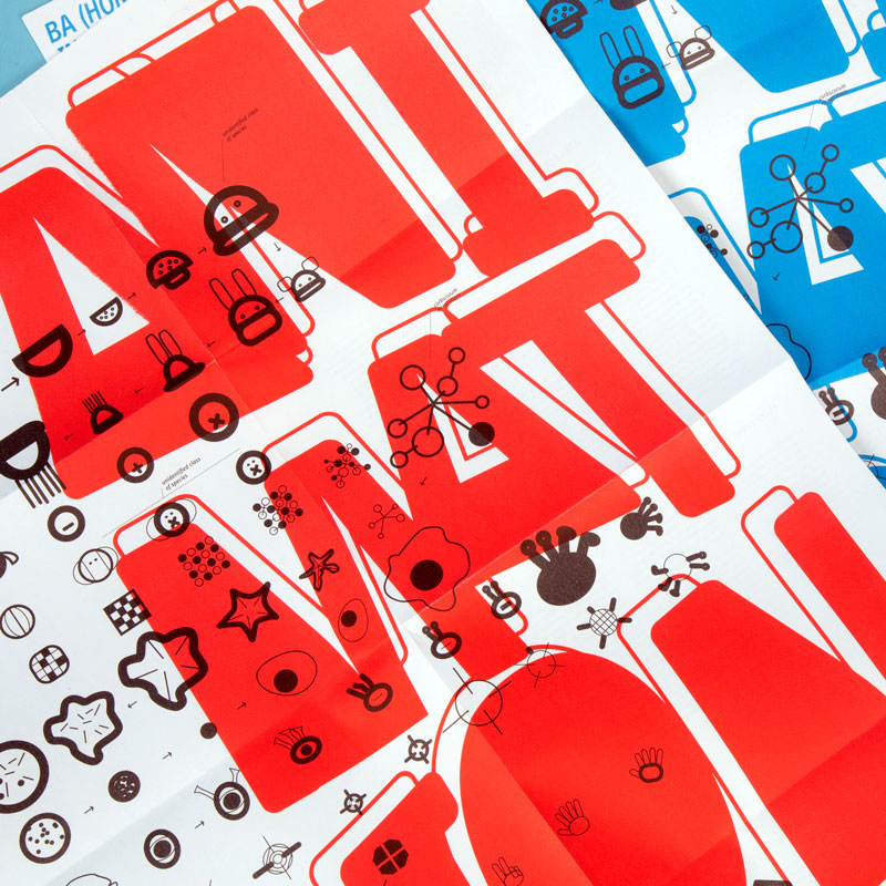
The task was to develop an informational and promotional brochure for the Animation Course at the Institute of Art, Design and Technology (IADT, Dun Laoghaire, Ireland). This design was selected and used by the school.
The concept behind the visuals is constant evolutionary development and evolvement. The series of icons starting as a simple circle and constantly progressing to more complicated and elaborate shapes, thus reflecting on the animation process and one of the exercises the animation students do.
The concept behind the visuals is constant evolutionary development and evolvement. The series of icons starting as a simple circle and constantly progressing to more complicated and elaborate shapes, thus reflecting on the animation process and one of the exercises the animation students do.


Ogham Stone
Digital illustration, Linocut


Project:
Editorial illustration for Ogham Stone Literature & Arts Journal, Spring 2016
Technique:
Digital illustration, Linocut.
Editorial illustration for Ogham Stone Literature & Arts Journal, Spring 2016
Technique:
Digital illustration, Linocut.
